The Framing Effect: a tool for positive user behavior and more.
A mix of good timing and acknowledging that productivity doesn't mean being 'on' every single second.
I often get asked, 'How do you balance posting, work, and freelancing without dropping the ball?' My secret? It's all about timing.
For instance, I dedicate part of my weekends to craft posts for the next two weeks or more. This way, I stay ahead of my content schedule.
A mix of good timing and acknowledging that productivity doesn't mean being 'on' every single second. It's about finding your rhythm and making the most of the time you have.
Anyway, here are the insights for this week:
—
🖼️ Framing Effect
The way things are shown to us can really affect what we choose.
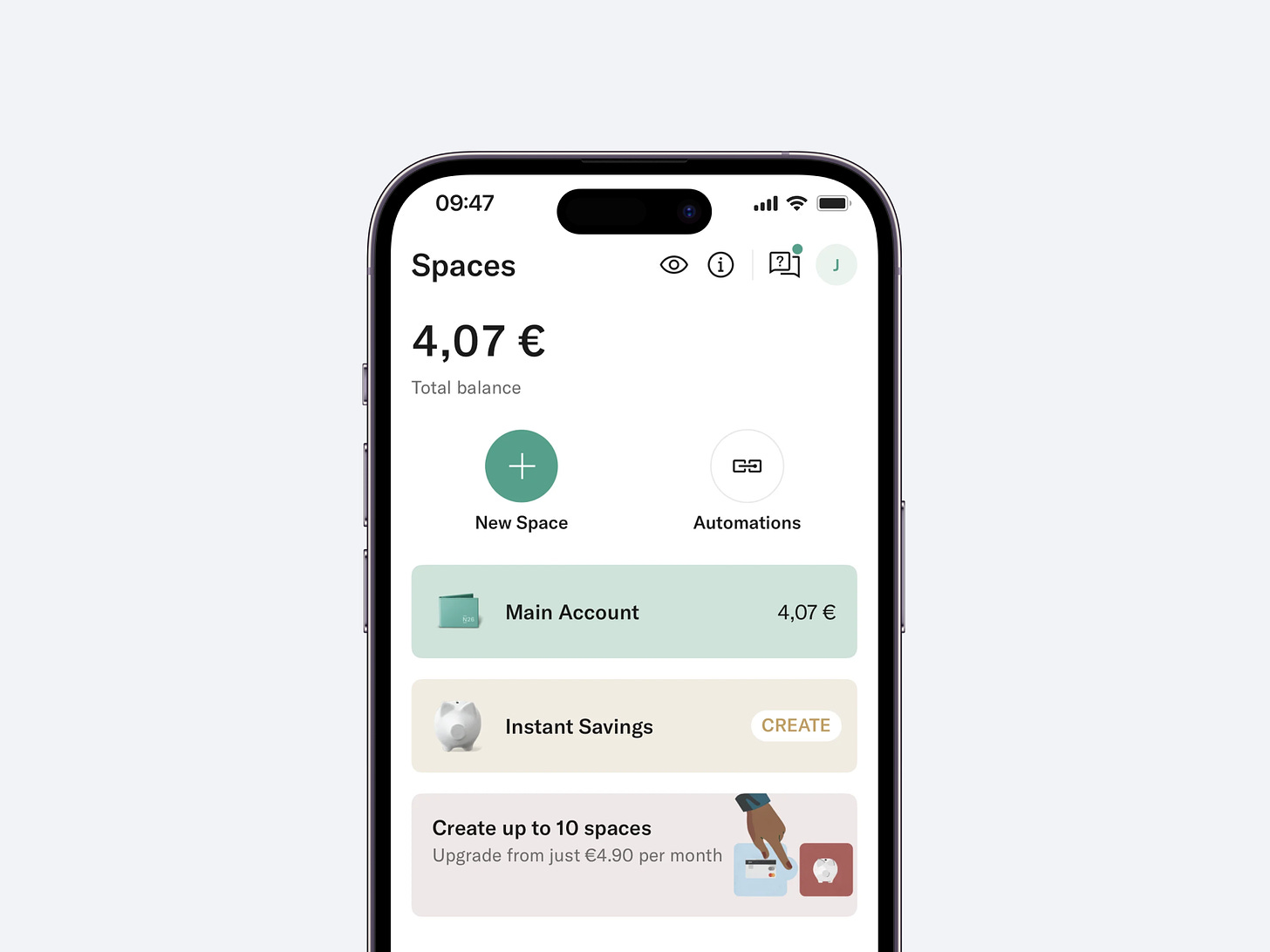
N26’s Smart Use of Framing
N26 leverages this effect through its 'Spaces' feature, which allows users to create sub-accounts earmarked for specific saving goals.
Feature — Spaces allow for the creation of goal-specific sub-accounts.
Benefit — Breaks down 'saving' into small, manageable, and achievable targets.
Outcome — Simplifies the concept of saving, making it more user-friendly and less intimidating.
Summary
When applied in design, the Framing effect can greatly enhance user engagement and decision-making.
💎 Benefits of Framing:
A cognitive bias influencing decisions based on presentation.
Positive frames lead to risk-averse choices; negative frames prompts.
Context is key in how choices are perceived and made.
📐 UI elements for Framing:
Divisions — Goal-oriented sections within accounts.
Indicators — Visual cues showing progress towards goals.
Customization — Personalized names and settings for user-specific goals.
🪄 How you can implement it?
Language — Use clear, positive descriptions for tasks and goals.
Personalization — Allow users to customize their experience.
Visualization — Show progress in an encouraging manner.
Feedback — Provide constructive and action-oriented user feedback.
By mirroring N26’s approach, you can craft an app experience that not only helps users achieve their goals but also turns the process into an engaging journey.
My Favorite Things this Week
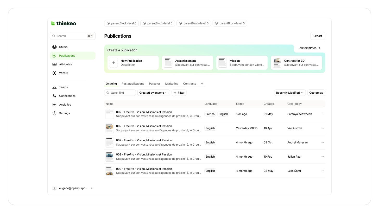
🎨 Design - Dashboard UI. I’ve found this dashboard on Twitter from OpenPurpose. It's clean, super easy to get what you're after, and has these cool, subtle gradients that just make everything look alive. Kinda like finding a crisp white tee that fits just right – simple but so good.
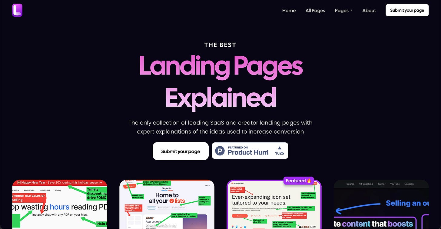
🗃️ Resource - Landing Pages Explained. I explored the site Landing Pages Explained and here's my take: It's a resourceful spot for anyone looking to boost their landing page game. This site offers a collection of top-notch SaaS and indie maker landing pages, breaking down the strategies used to ramp up conversions. What's cool is that it's not just a gallery of examples; it dives into the 'why' and 'how' behind each page, giving you a peek into the thought process of experienced designers and marketers. It's like having a guide through the minds of conversion pros
📚 Book - Hooked: How to Build Habit-Forming Products. I recently picked up "Hooked" by Nir Eyal, intrigued by its promise to unravel the secrets of habit-forming products. It's been an enlightening read, to say the least. The 'Hook Model' Eyal introduces—focusing on triggers, action, reward, and investment—has reshaped how I view product design and user engagement.
Have a great week!
Balint 🫶


